Viktoria Nouveau
Display
Proletariat
The Animals
Jacques Pépin
Fish and Chips
Proletariat
The Animals
Jacques Pépin
Fish and Chips
Mechanical Human Suits
Manfred von Richthofen
Try and take over the world
Bombardier Transportation
Mechanical Human Suits
Manfred von Richthofen
Try and take over the world
Bombardier Transportation
Subhead
Prince Richard, Duke of Gloucester
Charlie and the Chocolate Factory
Gee, Brain, whaddya wanna do tonight?
Denzel Washington on screen and stage
Prince Richard, Duke of Gloucester
Charlie and the Chocolate Factory
Gee, Brain, whaddya wanna do tonight?
Denzel Washington on screen and stage
Text

He fell in October 1918, on a day that was so quiet and still on the whole front, that the army report confined itself to the single sentence: All quiet on the Western Front.

He had fallen forward and lay on the earth as though sleeping. Turning him over, one saw that he could not have suffered long; his face had an expression of calm, as though almost glad the end had come.

Er fiel im Oktober 1918, an einem Tage, der so ruhig und still war an der ganzen Front, daß der Heeresbericht sich nur auf den Satz beschränkte, im Westen sei nichts Neues zu melden.

Er war vornübergesunken und lag wie schlafend an der Erde. Als man ihn umdrehte, sah man, daß er sich nicht lange gequält haben konnte; — sein Gesicht hatte einen so gefaßten Ausdruck, als wäre er beinahe zufrieden damit, daß es so gekommen war.

He fell in October 1918, on a day that was so quiet and still on the whole front, that the army report confined itself to the single sentence: All quiet on the Western Front.

He had fallen forward and lay on the earth as though sleeping. Turning him over, one saw that he could not have suffered long; his face had an expression of calm, as though almost glad the end had come.

Er fiel im Oktober 1918, an einem Tage, der so ruhig und still war an der ganzen Front, daß der Heeresbericht sich nur auf den Satz beschränkte, im Westen sei nichts Neues zu melden.

Er war vornübergesunken und lag wie schlafend an der Erde. Als man ihn umdrehte, sah man, daß er sich nicht lange gequält haben konnte; — sein Gesicht hatte einen so gefaßten Ausdruck, als wäre er beinahe zufrieden damit, daß es so gekommen war.

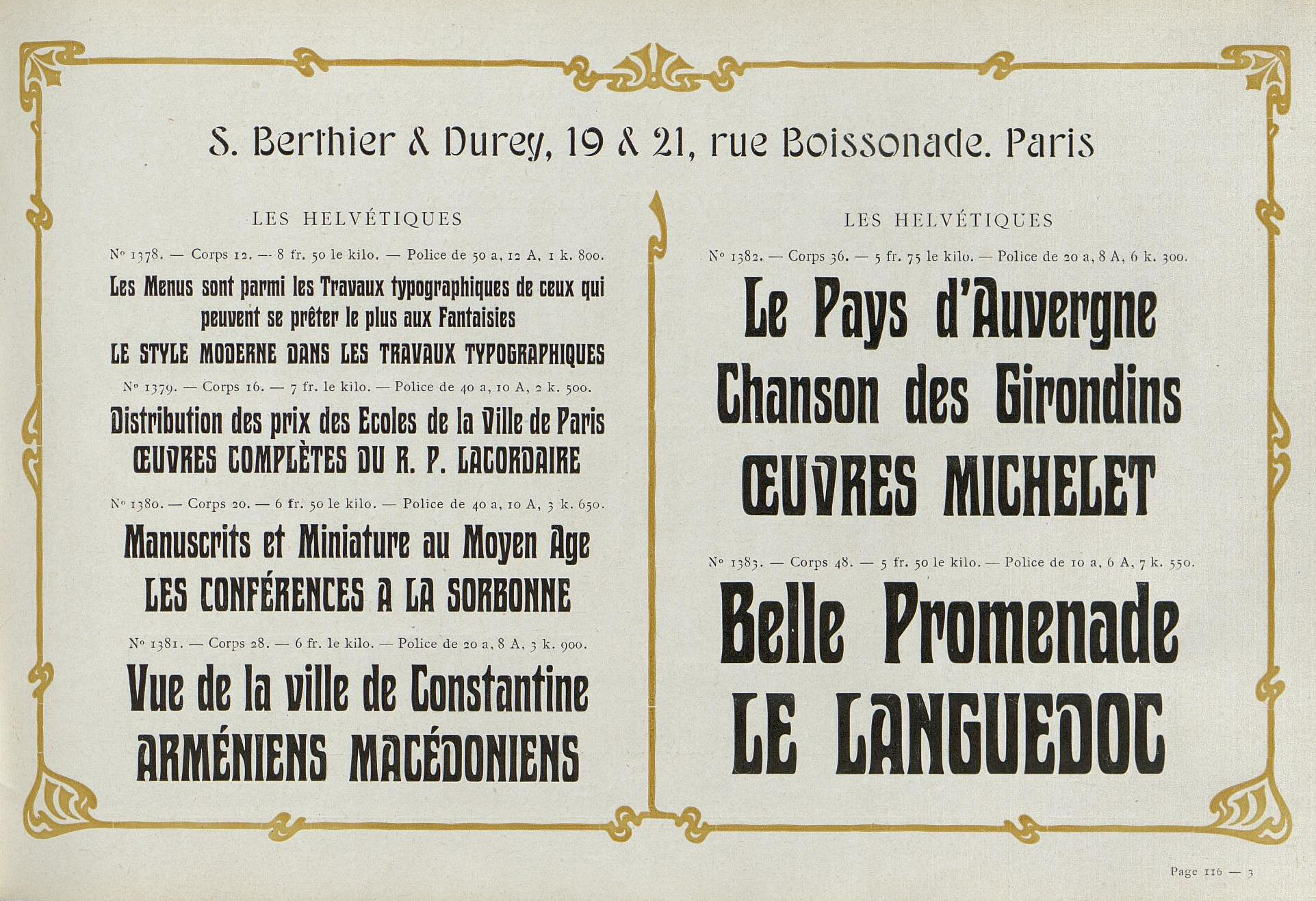
Two-page vintage French typographic sample listing typefaces with decorative border and pricing details.
▲ Historic specimen of Les Helvétiques from Berthier & Durey

About Viktoria Nouveau

Viktoria Nouveau is a revival of a typeface popular particularly in Europe in the first few decades of the twentieth century. While its exact origins and designer are unknown, it was originally released by Theinhardt around the year 1899 under the name Viktoria. It was a staple in the catalogues of several type foundries through the Art Nouveau era, including Theinhardt, Bauer, Nebiolo, and Poppelbaum, who variously released it under the names Viktoria, Phönix, Les Helvétiques, and Medea.
‍
This revival is a synthesis of the different versions of the font released between the type foundries. Largely faithful to the original design, the only major revision is in the capital ‘M’ and the capital 'Q', whose original design was too far out of the norm to be acceptable for modern users. The character set has also been greatly expanded to include necessary symbols and most western diacritics. In addition, the font features arbitrary fractions, superiors, inferiors, and case-sensitive forms. The Cyrillic comes from Poppelbaum’s 1914 specimen marketed to the Bulgarian market. For Viktoria Nouveau, Russian forms are standard and localised forms were added for Bulgarian and Serbian.
‍
The original font was issued in sizes from about 10 pt to multi-line woodtype. In keeping with this tradition, Viktoria Nouveau includes three optical sizes, Big, Medium, and Small.
‍
Viktoria Nouveau includes stylistic sets for more normal ‘A’, ‘V’, and ‘W’ historic to the original release. In addition, the revival also includes stylistic sets not included in the original font for a roman ‘D’, a single-story ‘a’, and, for my personal amusement, ‘Gaelic type’.

Languages

▾
Latin
Afrikaans
Albanian
Asu
Basque
Bemba
Bena
Breton
Catalan
Chiga
Colognian
Cornish
Croatian
Czech
Danish
Dutch
Embu
English
Esperanto
Estonian
Faroese
Filipino
Finnish
French
Friulian
Galician
German
Gusii
Hungarian
Icelandic
Indonesian
Irish
Italian
Kabuverdianu
Kalenjin
Kamba
Kikuyu
Kinyarwanda
Latvian
Lithuanian
Lower Sorbian
Luo
Luxembourgish
Luyia
Machame
Makhuwa-Meetto
Makonde
Malagasy
Maltese
Manx
Meru
Morisyen
North Ndebele
Norwegian
Bokmål
Norwegian
Nynorsk
Nyankole
Oromo
Polish
Portuguese
Quechua
Romanian
Romansh
Rombo
Rundi
Rwa
Samburu
Sango
Sangu
Scottish Gaelic
Sena
Serbian
Shambala
Shona
Slovak
Slovenian
Soga
Somali
Spanish
Swahili
Swedish
Swiss German
Taita
Teso
Turkish
Upper
Sorbian
Uzbek (Latin)
Volapük
Vunjo
Walser
Welsh
Western
Frisian
Zulu

Cyrillic

Belarusian
Bosnian
Bulgarian
Chechen
Macedonian
Russian
Serbian
Ukrainianian
"Viktoria Nouveau is a revival of a typeface popular particularly in Europe in the first few decades of the twentieth century. While its exact origins and designer are unknown, it was originally released by Theinhardt around the year 1899 under the name Viktoria. It was a staple in the catalogues of several type foundries through the Art Nouveau era, including Theinhardt, Bauer, Nebiolo, and Poppelbaum, who variously released it under the names Viktoria, Phönix, and Medea. ‍
This revival is a synthesis of the different versions of the font released between the type foundries. Largely faithful to the original design, the only major revision is in the capital ‘M’, whose original skewed design was too far out of the norm to be acceptable for modern users. The character set has also been greatly expanded to include necessary symbols and most western diacritics. In addition, the font features arbitrary fractions, superiors, inferiors, and case-sensitive forms. The Cyrillic comes from Poppelbaum’s 1914 specimen marketed to the Bulgarian market. For Viktoria Nouveau, Russian forms are standard and localised forms were added for Bulgarian and Serbian. ‍
The original font was issued in sizes from about 10 pt to multi-line woodtype. In keeping with this tradition, Viktoria Nouveau includes three optical sizes, Big, Medium, and Small. ‍
Viktoria Nouveau includes stylistic sets for more normal ‘A’, ‘V’, and ‘W’ historic to the original release. In addition, the revival also includes stylistic sets not included in the original font for a roman ‘D’, a single-story ‘a’, and, for my personal amusement, ‘Gaelic type’.
© Ian Farnam
LOADING
☞